Want a full tour of our newly renovated kitchen in 4,390 words or less? Well settle in and sip some LaCroix, because this is the post for you.
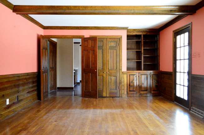
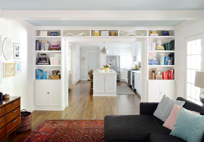
Shall we begin with a few before and afters? You probably remember this view from our living room where you couldn't actually see the kitchen.
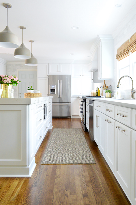
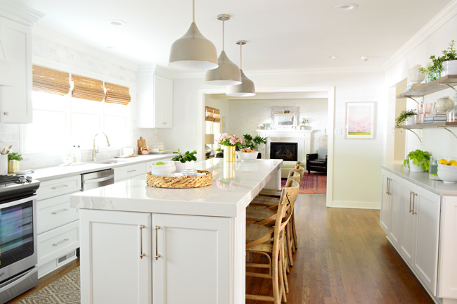
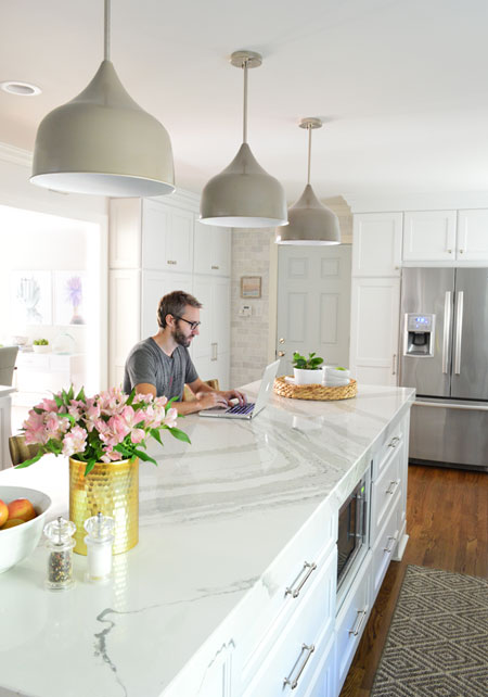
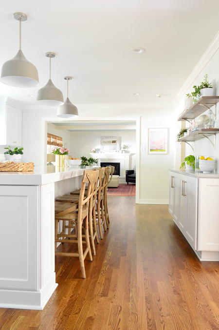
Well, now it looks like this:
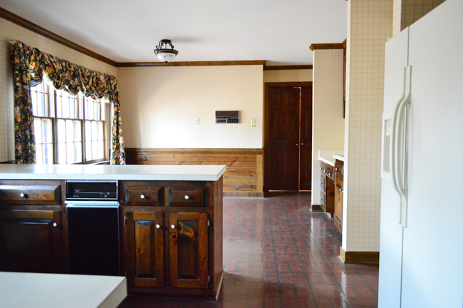
And here's the old view from the other side, which is what you saw when you stepped in the door from the garage.
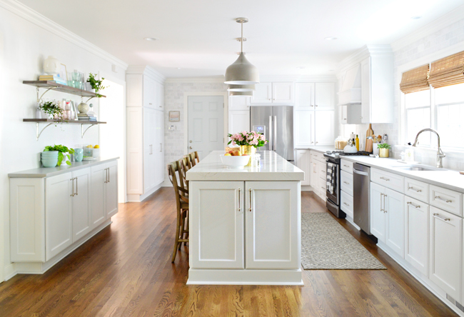
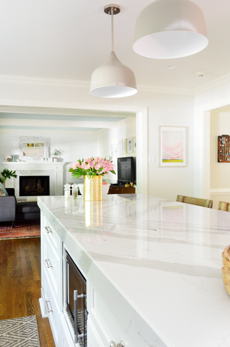
These days it's looking a little different.
There's obviously TONS of stuff to cover about this space, but today our main goal is to dish out lots of after photos and tell the story behind the major material choices that we made in the room (since we previously covered planning the layout and gutting & rebuilding). So let's start with the cabinets.
Cabinets
You guys know we're suckers for a white kitchen (we did one in our first and second house and loved 'em). So there wasn't ever much doubt in our mind that it's what we'd do here – especially since the trees in our backyard block a fair amount of morning light in here, and well: white cabinets = maximum brightness.
Side note: this week's podcast, episode #20, is all about white walls (are they overdone? Played out? Still awesome? Only pretty in photos but stark in person? We interviewed two other bloggers about it, and weighed in ourselves).
As we mentioned in our last kitchen post, we decided to order our cabinets through a local company called Chesapeake Bay Cabinet Company. We've worked with them on builder spec homes, so it made sense to collaborate on our own house since we enjoy working with them and love their finished product. We considered a few brands of cabinets that they sell, but ended up going with Quality Cabinets for a number of reasons: nice solid craftsmanship, soft close drawers that come standard, and being able to upgrade to a 5 piece drawer (one with a recessed panel instead of a flat front).
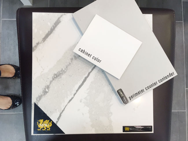
We also appreciate that their stock white cabinet color is a nice crisp white with only a tiny hint of gray. Sometimes stock white cabinets can skew more yellow or blue/gray than you might prefer, so bringing home a sample door to make sure it doesn't clash with all of your house's white trim (or your counter/tile selections) is always a good call. Even though we love a clean-lined shaker door, we went with a fairly traditional door style with a double beveled edge because it felt like it added a little something extra while fitting the character of our house.
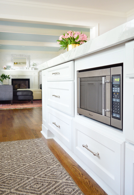
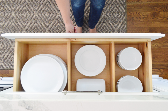
We'll get more into how we organized and arranged the cabinets in another post, but we went with A LOT of drawer bases. Almost the whole island is basically big, deep, drawers. I know. Hubba, hubba.
Some of you might be wondering why we didn't do an Ikea kitchen. While we've used (and loved!) Ikea cabinetry in our laundry room & our bonus room, for such a big project where we've already mentioned that speed was a motivating factor, we thought these were our best choice. Our experience with Ikea is also that it takes some ingenuity to pull off some of the finishing touches (trim, filler strips, etc) to make sure everything looks balanced and fully fills the space you want it to fill (remember this?). So we just felt more confident working with our local guys to make sure we could pull off everything we wanted to do in here.
Counters
Having worked with several materials by this point (granite, corian, marble, laminate, and even concrete) we actually knew pretty quickly that we wanted to go with quartz. Quartz is a man-made counter that utilizes natural quartz to look and feel like real stone, while dodging some of real stone's hassles (it's less prone to scratching and doesn't need to be re-sealed). It's non-porous, so it stands up better to juice, oil, wine, tomato, coffee and other kitchen stains along with not holding onto bacteria, like raw chicken goo. So since we plan to be here for the long haul (and, well, #kids) it felt like the smartest choice for us. Plus you already heard how their 11ft super slabs solved our island size conundrum.
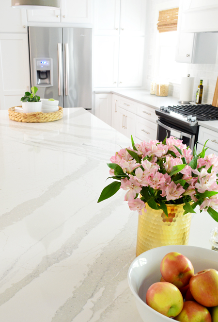
We were initially attracted to a Cambria quartz style called Ella, which is white-ish with some subtle movement that mimics marble (it looks sort of like Carrera) so it felt like a solid choice #counterpun. But then we came across a slightly bolder design called Brittanicca, which has a more pronounced pattern with a bit more contrast and wider, larger-scale veining.
Although the sample of it was surprisingly large, we knew it was too big of a decision to make without seeing a full slab in real life (we've been down that road before). So we went to a few local stone yards and fabricators until we could lay our eyes on a nice big slab of it. And when we finally tracked one down in person, we knew it was the one. We thought the thicker, larger-scale veining would make for a nice accent in the middle of the room. Especially when paired with a softer more concrete-like choice on the perimeter cabinets.
We also literally “went big” with the island and chose to do it triple-thick (3″ vs. the standard 1.25″ profile). With such a large island (that beast is 10′ long) we thought it might look extra cool with something more substantial on top. It's one of those “special choices” that we initially worried wouldn't register nearly as much as something more obvious and statement-y… you know, like a bold look-at-me paint color or a giant chandelier. So we had a few “will this choice even be noticeable?” discussions where we almost backpedaled and decided not to bother. But all that worry vanished as soon as it was installed. It's one of our favorite things about the entire remodel, and it's the #1 thing people comment on when they walk in.
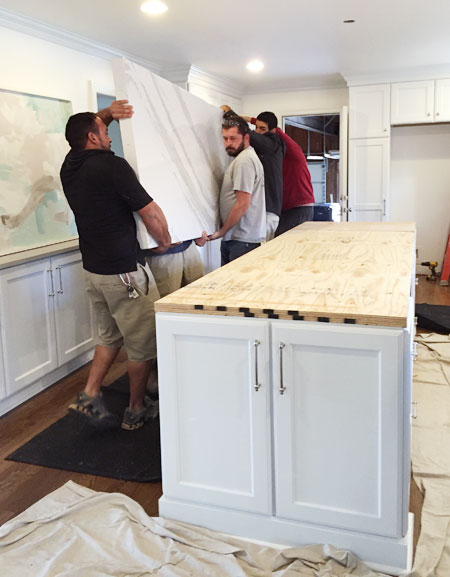
The secret is that it's not actually extra thick. Whenever someone asks how it's done, we liken it to the lid of a shoe box. It just has side pieces around the edges that were mitered and glued to look as if it's truly a super thick solid slab. And since they were able to cut all the sides from the same slab, the only extra cost was for fabrication – not extra material. You can also see from the photo below that it sits atop a big piece of thick plywood, which snugly supports the slab. And yes, it took SIX guys to carry it in. Not because it's so heavy (well, it is heavy) but mostly because the original four guys that showed up were having trouble getting a good grip on the thicker edge, so they called in two more guys for backup.
Side note: the island veining is always harder to see in photos than in real life since it's so shiny and reflects the white ceiling in pics, but that photo above, of the guys carrying it in, actually captures it pretty well. It's definitely not mostly white looking. The veins are large and in charge and impossible to miss when you see it in person.
Oh and the first fabricator we visited said we'd need a seam in our island, not because they didn't have a big enough slab, but because they didn't think it could be transported into the house. So we got a second opinion from a second local fabricator and they told us they'd happily send more guys to carry it if we wanted something without a seam. They also had an extra thick mitered counter right in their showroom, so we knew they could pull off the look. The lesson here? Don't stomp on your dreams based on just one opinion. Also, in the ever-wise words of Selena Gomez: the heart wants what it wants.
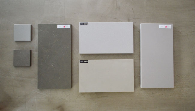
For the perimeter counters, we liked the color of our previous concrete-covered counters so much that we decided to go with a quartz that mimicked them. So we brought some samples home from a bunch of different makers to see how they compared.
The winner was the bottom-middle one, since its warm undertones matched the warmth of Brittanica's veining. It's called Ice-Zement, by Compac. The cool thing is that it comes in a gloss or a matte finish, so we went with the matte one since it's more like concrete and allows the shiny island to stand out in its own right. Oh and we ordered the perimeter quartz from a different fabricator because they were running a better deal on that color. So it's just another reminder to shop around!
Hardware, Faucet, & Shelf Brackets
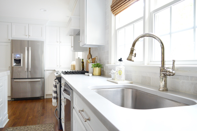
As popular as brass and gold are these days, we felt more confident that we'd like a polished nickel tone in here for the long haul, so we went with that for all of the “permanent” fixtures. And although I had pinned LITERALLY TEN MILLION BRIDGE FAUCETS, we ended up with a nice functional pull-down faucet with one handle, because John is the function police and he said it would have bugged him (and probably me) to have to use two handles to adjust the water temperature instead of one. In the end I love this faucet, so don't tell him this, but he was right.
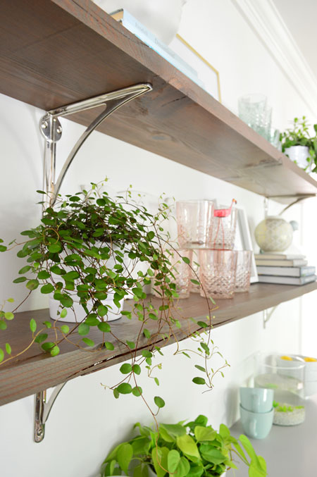
We also went with polished nickel shelf brackets and cabinet hardware, which both feel nice and weighty and solid. Polished nickel has a slightly warmer undertone than chrome (see the almost-gold hints in our shiny faucet above?) while chrome has more of a shiny-blue undertone that feels cooler. Both are pretty, but between the wood floors, woven blinds, and some of the warmer veining in the island, we thought some subtle warmth in the metal would be nice.
One thing we kind of agonized over was deciding which cabinets got pulls (handles) and which ones got knobs. We eventually settled on all the cabinets above the counter getting knobs, and everything that went below the counter getting pulls. And to make life somewhat easier, everything that earned a pull got the same sized pull.
No comments:
Post a Comment